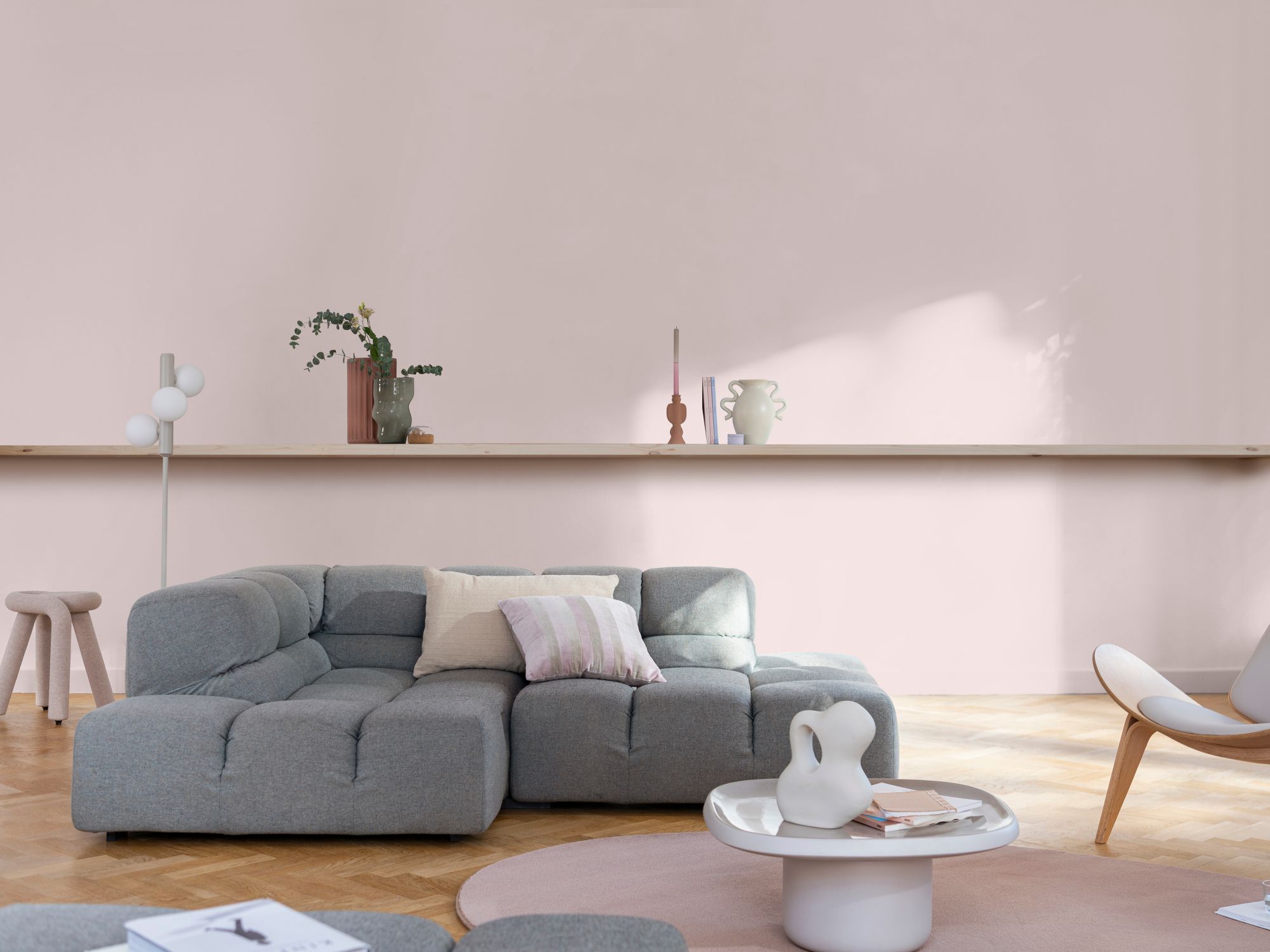
THREE COLOUR SCHEMES USING DULUX SWEET EMBRACE

Dulux have announced 'Sweet Embrace' as their Colour of the Year 2024. Described as a 'kind and delicate tone' it is a soft, pink shade. It's cooler than the ever popular blush pink, but far from a cold, bubblegum hue. With blue undertones, it is definitely on the cooler end of the scale, but the addition of grey makes it more sophisticated than a typical baby pink.
I love the inspirational schemes Dulux create to help you incorporate the Colour of the Year into your own home. Pairing with other cool tones will create a fresh, clean look, but adding colours with yellow undertones will create a warmer scheme. As with all colours, this shade will look different depending on what you pair it with, and which direction your room faces, so always get a tester!
I've created three room schemes using Sweet Embrace to give you a little inspiration on fabrics, textures and colours you can pair it with, all of which have completely different vibes.
First up, a sophisticated scheme, perfect for a cosy living room.

Mixing Sweet Embrace with warmer, darker lilacs and a soft beige warms up the shade, and I've added in some cooler toned blues with lots of texture and some contemporary prints to create a sophisticated scheme.

Next up, I've created a sweet scheme perfect for a kids bedroom or playroom. The cool toned blues work well with the soft pink and keep it looking fresh, but the pop of yellow adds warmth and a bit of playfulness.

Lastly, a fun, vibrant scheme I thought would look fabulous in a kitchen, but could work in any space. Sweet Embrace works well as a neutral base for bolder colours, or you could paint your kitchen cabinets and make it the focal point.
If you're looking to inject a bit of colour but not sure where to start, Sweet Embrace will work well as an alternative to white walls or ceilings. Inspired by the softness of feathers and clouds, it's described as optimistic and is certainly a calming shade. It is a versatile colour and works well with many colours and takes on different tones in different lights, but as with all paint colours, get a tester pot to see how it looks in your space.
If you're looking for some help creating a colour scheme, I can help! Click here to check out my interior design consultation packages and see how we can work together.

Comments